This is the latest of my River paintings from sketches on the same spot. 60 x 60 oil on canvas. I notice they are getting looser which I hope is progress. My aim has been to get depth by juxtaposing complementary colours and also to get values right
This is the latest of my River paintings from sketches on the same spot. 60 x 60 oil on canvas. I notice they are getting looser which I hope is progress. My aim has been to get depth by juxtaposing complementary colours and also to get values right
Louise Balaam - Monthly Landscape Painting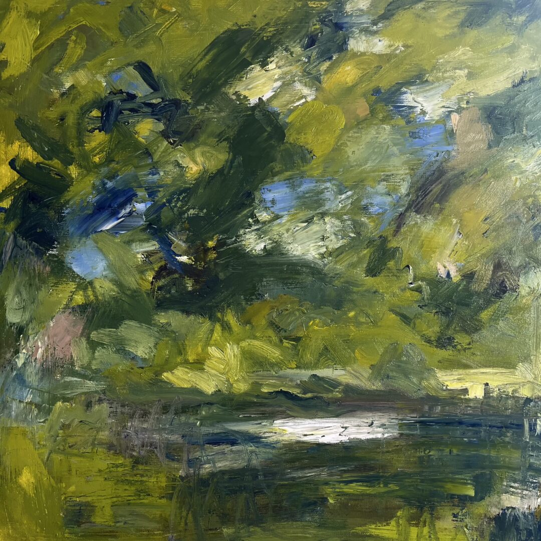
This painting is lovely….glorious greens!
Thank you Julian and Louise for your encouraging comments. I agree about the water and am going back into it so to speak. I think some of the colours lacklustre and this is partly due to the support which is called canvas but is cotton I think and extremely absorbent despite the fact that I primed it with Michael Harding primer. It feels different to any other Windsor and Newton I have used previously. I discovered Henrietta Hoyer Millar on your Instagram Louise and I am very inspired by her work. I do feel an affinity with her subjects and her whole approach to painting. Thank you
Me too Elizabeth! Love all those beautifully judged greens and blues, looks like lovely luscious paint too. A very good decision not to include the sky, it makes the painting more striking and gives a great feeling of a shady, enclosed spot. The only thing I’d be tempted to do if it was mine would be to darken the tone of the light on the river just a smidge, so it’s keyed in to the prevailing colours. You can always check out potential changes like this by painting a bit of paper and holding it up to the painting or maybe lightly applying it, depending on how wet the paint is.
I like this a lot,