Get 10% OFF your first online course – Offer expires in minutes.
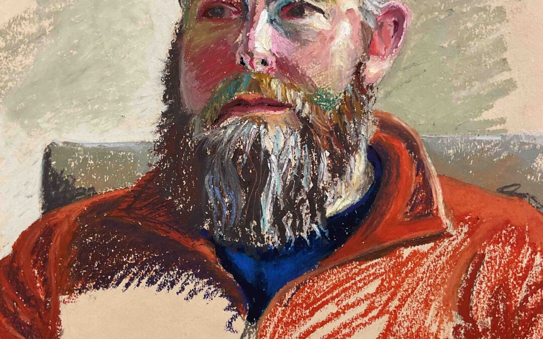
I enjoyed creating this portrait immensely, particularly trying to build up the complexity of the pastel in the face. In doing so I think I lost my way in other areas. The backdrop is a curtain and I initially sketched in value to loosely indicate the folds, having decided that this added to much detail I scraped it off and started again and again, each attempt ending up more overworked than the last.

I enjoyed creating this portrait immensely, particularly trying to build up the complexity of the pastel in the face. In doing so I think I lost my way in other areas. The backdrop is a curtain and I initially sketched in value to loosely indicate the folds, having decided that this added to much detail I scraped it off and started again and again, each attempt ending up more overworked than the last.

I enjoyed creating this portrait immensely, particularly trying to build up the complexity of the pastel in the face. In doing so I think I lost my way in other areas. The backdrop is a curtain and I initially sketched in value to loosely indicate the folds, having...
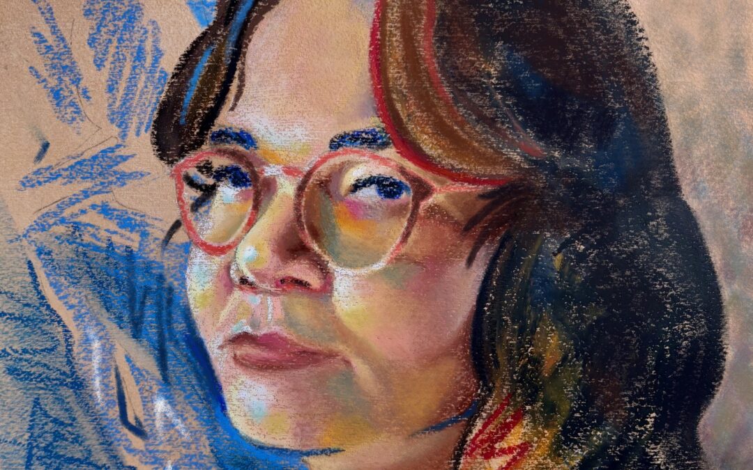
Final painting! I used a 31x41cm (12x16in) cold press watercolor paper, toned it with a light raw sienna gouache wash, then primed it with clear acrylic gesso (didn’t quite smooth the texture, but I ended up liking how it worked). This was my third attempt at the composition; the first two got too detailed and muddy. This time, I focused on keeping it simple and letting the paper show through as much as possible. I left non-essential parts as expressive lines (like the blue curtain or my orange blouse) or blended them into the background (like my hair). I’m really happy with how it turned out and super grateful for all the tricks I learned during this course. Thanks, Samir!

Final painting! I used a 31x41cm (12x16in) cold press watercolor paper, toned it with a light raw sienna gouache wash, then primed it with clear acrylic gesso (didn’t quite smooth the texture, but I ended up liking how it worked). This was my third attempt at the composition; the first two got too detailed and muddy. This time, I focused on keeping it simple and letting the paper show through as much as possible. I left non-essential parts as expressive lines (like the blue curtain or my orange blouse) or blended them into the background (like my hair). I’m really happy with how it turned out and super grateful for all the tricks I learned during this course. Thanks, Samir!

Final painting! I used a 31x41cm (12x16in) cold press watercolor paper, toned it with a light raw sienna gouache wash, then primed it with clear acrylic gesso (didn’t quite smooth the texture, but I ended up liking how it worked). This was my third attempt at the...
Last week’s self portrait. I feel this is overworked when considering again the instructions from Samir. I got carried away with blending and the blue clothing  appears to come forward more than I intended.  A4 size pastel paper. Duration approx 1 hour.

Last week’s self portrait. I feel this is overworked when considering again the instructions from Samir. I got carried away with blending and the blue clothing appears to come forward more than I intended. A4 size pastel paper. Duration approx 1 hour.
Last week's self portrait. I feel this is overworked when considering again the instructions from Samir. I got carried away with blending and the blue clothing appears to come forward more than I intended. A4 size pastel paper. Duration approx 1 hour.
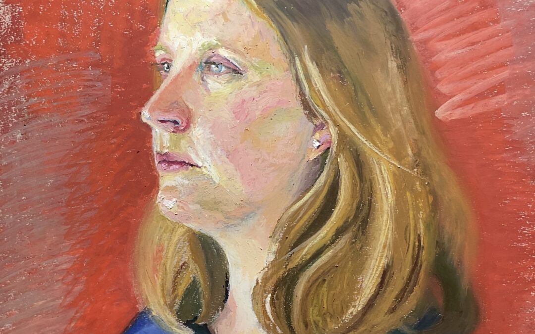
Painted from a reference photo of my son, photographed in afternoon light in front of a window.
I tried to focus on using more chromatic colours in the shadow without losing the light/shadow relationship and also on trying to select colours a little more intuitively, hence this attempt being completed in less time.

Painted from a reference photo of my son, photographed in afternoon light in front of a window. I tried to focus on using more chromatic colours in the shadow without losing the light/shadow relationship and also on trying to select colours a little more intuitively, hence this attempt being completed in less time.

Painted from a reference photo of my son, photographed in afternoon light in front of a window. I tried to focus on using more chromatic colours in the shadow without losing the light/shadow relationship and also on trying to select colours a little more intuitively,...
This is a portrait of my son.  He only gave me 40 minutes, so the underdrawing isn’t very strong and I would have liked more time to work on the pastels.  I like the colours overall, but again struggle with the transitions between light and dark, and the transitions within the lights.  I spent more time setting it up than I would normally do, made sure half of his face was facing the window (adding an additional light on that side), and also paid attention to resolving the edges and creating some angles in the overall composition to make it more interesting.

This is a portrait of my son. He only gave me 40 minutes, so the underdrawing isn’t very strong and I would have liked more time to work on the pastels. I like the colours overall, but again struggle with the transitions between light and dark, and the transitions within the lights. I spent more time setting it up than I would normally do, made sure half of his face was facing the window (adding an additional light on that side), and also paid attention to resolving the edges and creating some angles in the overall composition to make it more interesting.

This is a portrait of my son. He only gave me 40 minutes, so the underdrawing isn't very strong and I would have liked more time to work on the pastels. I like the colours overall, but again struggle with the transitions between light and dark, and the...
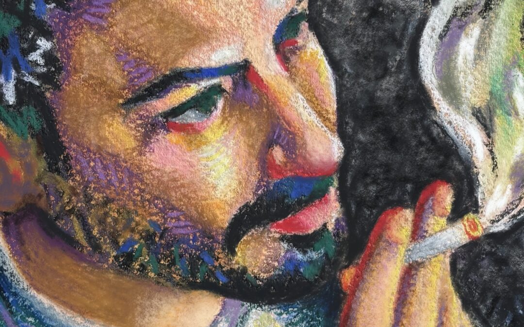
I was much happier working at a bigger scale (this is about 50 x 40 cm).  I also have some more oil pastels (treated myself to some from Sennelier) so I have more colours now.  I still find I use them in a linear fashion though, rather than blobs of colour/splodges of paint like you do!  This is obviously not a self portrait, but from a session from life in a very dark room!

I was much happier working at a bigger scale (this is about 50 x 40 cm). I also have some more oil pastels (treated myself to some from Sennelier) so I have more colours now. I still find I use them in a linear fashion though, rather than blobs of colour/splodges of paint like you do! This is obviously not a self portrait, but from a session from life in a very dark room!

I was much happier working at a bigger scale (this is about 50 x 40 cm). I also have some more oil pastels (treated myself to some from Sennelier) so I have more colours now. I still find I use them in a linear fashion though, rather than blobs of colour/splodges of...
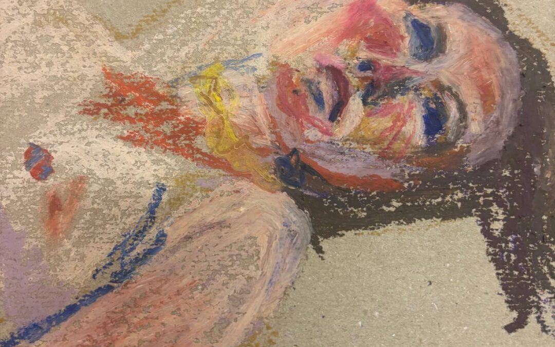
This is supposed to be a self portrait . First  time putting in arms as I usually do head & shoulders. Still finding detail difficult and also laying colours on top of each other.
Much easier to mix colour with paint than to use oil pastels. Need advice.

This is supposed to be a self portrait . First time putting in arms as I usually do head & shoulders. Still finding detail difficult and also laying colours on top of each other. Much easier to mix colour with paint than to use oil pastels. Need advice.

This is supposed to be a self portrait . First time putting in arms as I usually do head & shoulders. Still finding detail difficult and also laying colours on top of each other. Much easier to mix colour with paint than to use oil pastels. Need...
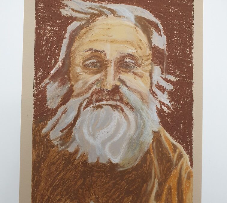
I don’t have much time to paint this week because of work, so this took me about 1 hour. I used a ~13×18 cm (5×7 inch) cold press watercolor paper, which, in hindsight, was a big mistake: I just couldn’t achieve the level of detail, layering, and texture I wanted on such a small surface. Blending with dilution and paper stubs helped, but some areas still ended up a bit muddy. I also think I instinctively leaned too much into realism, a habit I’m trying to rein in.

I don’t have much time to paint this week because of work, so this took me about 1 hour. I used a ~13×18 cm (5×7 inch) cold press watercolor paper, which, in hindsight, was a big mistake: I just couldn’t achieve the level of detail, layering, and texture I wanted on such a small surface. Blending with dilution and paper stubs helped, but some areas still ended up a bit muddy. I also think I instinctively leaned too much into realism, a habit I’m trying to rein in.

I don’t have much time to paint this week because of work, so this took me about 1 hour. I used a ~13×18 cm (5×7 inch) cold press watercolor paper, which, in hindsight, was a big mistake: I just couldn’t achieve the level of detail, layering, and texture I...
It was difficult, but interesting! The light from the window was weak and cool, and so were the shadows on the face and in the background. After finishing the portrait, I returned to it the next day and warmed up all the shadows. Also, this portrait doesn’t look anything like me… but it was still a great exercise!

It was difficult, but interesting! The light from the window was weak and cool, and so were the shadows on the face and in the background. After finishing the portrait, I returned to it the next day and warmed up all the shadows. Also, this portrait doesn’t look anything like me… but it was still a great exercise!

It was difficult, but interesting! The light from the window was weak and cool, and so were the shadows on the face and in the background. After finishing the portrait, I returned to it the next day and warmed up all the shadows. Also, this portrait doesn’t look...
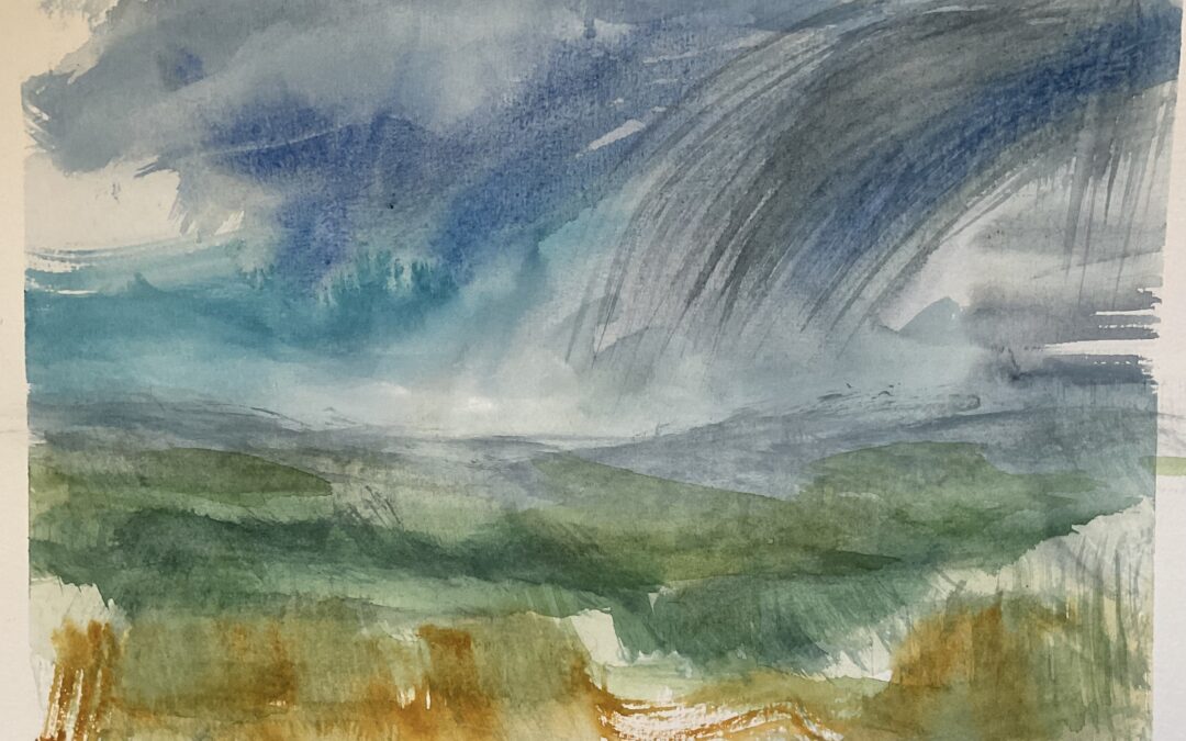
Another from the morning sketching the view down the valley. It was a good few hours exploring watercolour & finding out how I cope with it. Really fascinating finding different ways to interpret the same view at different moments. I managed to paint rather a lot of these and whiled away a good few hours playing & investigating; how wet to make the paint, wet the paper first – or not, intensity of colour, how the paint bleeds & makes a mess,  and so much more. I’m thinking that watercolour will be good to take sketching, to use on its own or to add to my usual watersoluble crayons , pencils & charcoal.

Another from the morning sketching the view down the valley. It was a good few hours exploring watercolour & finding out how I cope with it. Really fascinating finding different ways to interpret the same view at different moments. I managed to paint rather a lot of these and whiled away a good few hours playing & investigating; how wet to make the paint, wet the paper first – or not, intensity of colour, how the paint bleeds & makes a mess, and so much more. I’m thinking that watercolour will be good to take sketching, to use on its own or to add to my usual watersoluble crayons , pencils & charcoal.

Another from the morning sketching the view down the valley. It was a good few hours exploring watercolour & finding out how I cope with it. Really fascinating finding different ways to interpret the same view at different moments. I managed to paint rather a lot...
A watercolour sketch from this morning. Trying very hard to work out how to use watercolour paint, which Im finding quite tricky, but I’m slowly learning that I do have to employ some patience with it. It’s going to take more playtime to find out if I can use them for sketching without  making a big muddy mess

A watercolour sketch from this morning. Trying very hard to work out how to use watercolour paint, which Im finding quite tricky, but I’m slowly learning that I do have to employ some patience with it. It’s going to take more playtime to find out if I can use them for sketching without making a big muddy mess

A watercolour sketch from this morning. Trying very hard to work out how to use watercolour paint, which Im finding quite tricky, but I’m slowly learning that I do have to employ some patience with it. It’s going to take more playtime to find out if I can use them for...
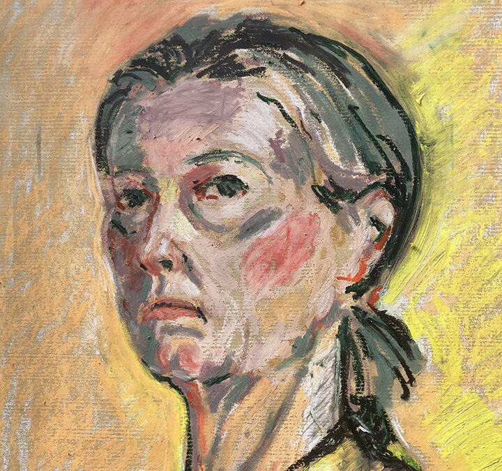
I enjoyed doing this.  I probably spent just half an hour but didn’t know what else to do.  I found the demo this week very helpful and it taught me to layer colours more densely instead of relying on blending.  I also love the idea of pushing the colour further than what you see in real life.

I enjoyed doing this. I probably spent just half an hour but didn’t know what else to do. I found the demo this week very helpful and it taught me to layer colours more densely instead of relying on blending. I also love the idea of pushing the colour further than what you see in real life.

I enjoyed doing this. I probably spent just half an hour but didn't know what else to do. I found the demo this week very helpful and it taught me to layer colours more densely instead of relying on blending. I also love the idea of pushing the colour further...
For HW2, I decided to go for a self-portrait on 23×31 cm hot press watercolor paper. I started with a mummy brown gouache mix as my mid-tone base, which gave me a solid foundation to build on. Instead of focusing on realistic skin tones, I wanted to experiment with the lighting: cooler on the right, warmer on the left. I also brought in a palette knife to add some texture and a few expressive lines.

For HW2, I decided to go for a self-portrait on 23×31 cm hot press watercolor paper. I started with a mummy brown gouache mix as my mid-tone base, which gave me a solid foundation to build on. Instead of focusing on realistic skin tones, I wanted to experiment with the lighting: cooler on the right, warmer on the left. I also brought in a palette knife to add some texture and a few expressive lines.

For HW2, I decided to go for a self-portrait on 23×31 cm hot press watercolor paper. I started with a mummy brown gouache mix as my mid-tone base, which gave me a solid foundation to build on. Instead of focusing on realistic skin tones, I wanted to experiment...
Another self portrait- at least the sitter is always there when needed!
I have called it finished, though as ever I can see things I want to correct when I have taken time away from the work. 
I enjoyed doing this but feel that I can push the thickness of application and expressive marks a lot further.

Another self portrait- at least the sitter is always there when needed! I have called it finished, though as ever I can see things I want to correct when I have taken time away from the work. I enjoyed doing this but feel that I can push the thickness of application and expressive marks a lot further.

Another self portrait- at least the sitter is always there when needed! I have called it finished, though as ever I can see things I want to correct when I have taken time away from the work. I enjoyed doing this but feel that I can push the thickness of application...
Hey guys! Hope the work is going well for you all! A small detail shot of a portrait for you to show the layering and different layer thickness. You can be economical in your application in terms of surface coverage. Use the color of your surface

Hey guys! Hope the work is going well for you all! A small detail shot of a portrait for you to show the layering and different layer thickness. You can be economical in your application in terms of surface coverage. Use the color of your surface

Hey guys! Hope the work is going well for you all! A small detail shot of a portrait for you to show the layering and different layer thickness. You can be economical in your application in terms of surface coverage. Use the color of your surface