
by Kimberleigh Wood | 2nd December 2024
Diptych- (2) 6"x6" oil | wood panels- I composed this image using still footage ( "Beaches" movie) of Bette Midler and Barbara Hershey, dropping them into the Crystal Cove background of the scene's location. Essentially the color is somewhat...

by Kimberleigh Wood | 2nd December 2024
Study- 8"x10" casein on carton board- Working my way through family photos. Looking to build a body of work using the images as a springboard for a narrative. Appreciate any thoughts to this visual direction. Thanks. k
by Jasmin Cook | 2nd December 2024
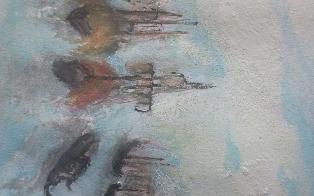
This is following the lesson about Turner. Have a new found admiration for his detail and accuracy. Made me think more carefully about the substance of what I am painting.

by Christine Berrington | 1st December 2024
Here's a colour study in watercolour and pastel, representing the colours pretty much as they were.
by Christine Berrington | 28th November 2024
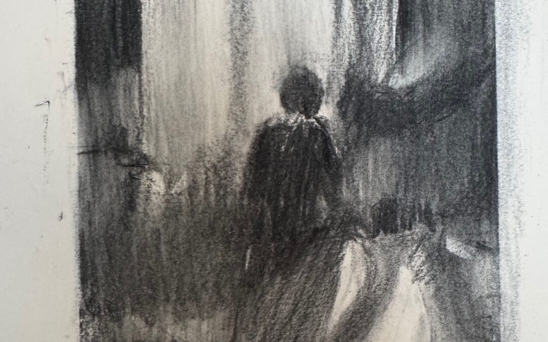
Thinking about content and composition; after various sketches, focussing on the figure and the immediate shapes of light and tone is really what I wanted to show.
by Christine Berrington | 28th November 2024
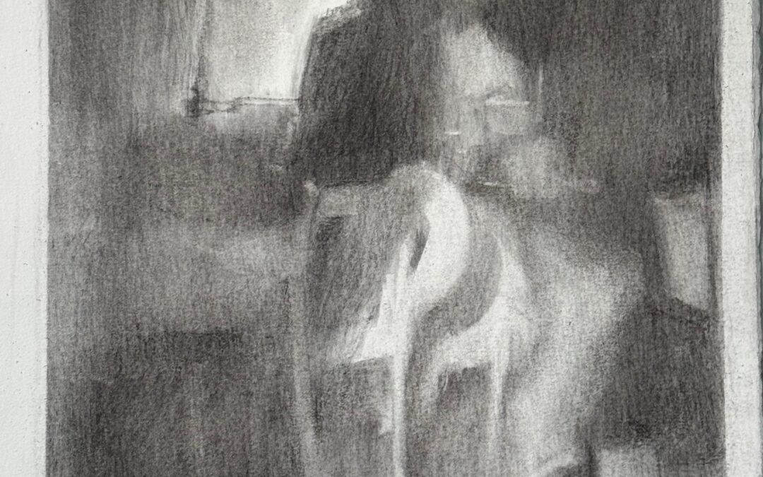
Reducing the content maybe works better…

by Christine Berrington | 28th November 2024
This is a drawing I was working on as this course began. From which I have done a series of studies and sketches with the aim of producing a final piece. I will post the various drawings – I seem to have to post these individually ?

by Mark Dunford | 26th November 2024
David Bomberg – Ronda – oil on canvas
by Mark Dunford | 26th November 2024
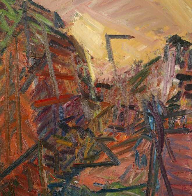
Frank Auerbach Mornington Crescent – Winter morning 1989

by Mark Dunford | 26th November 2024
Michael Andrews juxtaposes a mass of visual elements taken from various photographic sources. All Night Long (1963-4)
by Therese Lunde | 21st November 2024
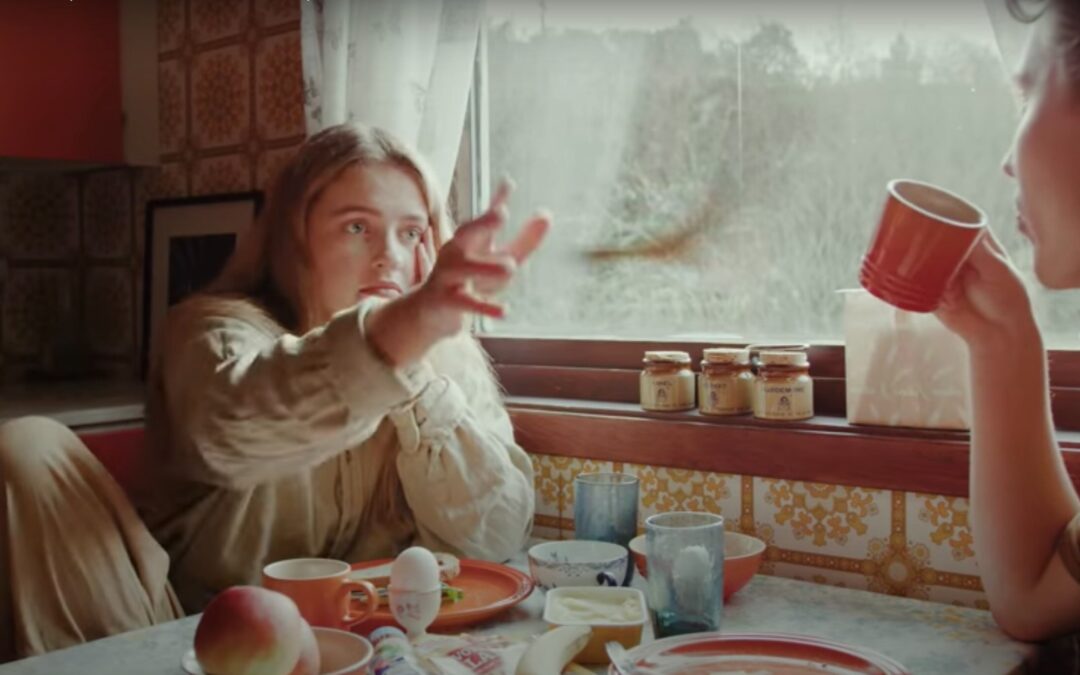
This is my reference photo
by Therese Lunde | 21st November 2024
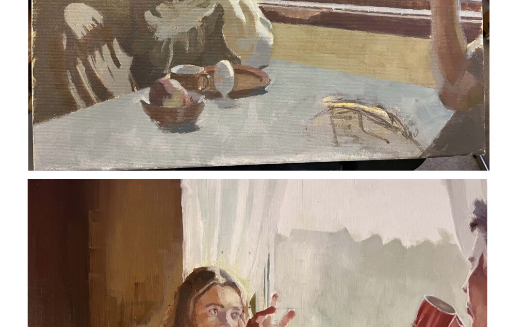
This was a helpful task. I made a study limited to three values. It took a lot of concentration seeing and judging values constantly. I am not used to doing that. I used a gray scale/value finder and a red filter to look through to judge. I see how doing more...

by Mark Dunford | 19th November 2024
Peter Van Dyck – the barrelling of vision
by Juli Fejer | 17th November 2024
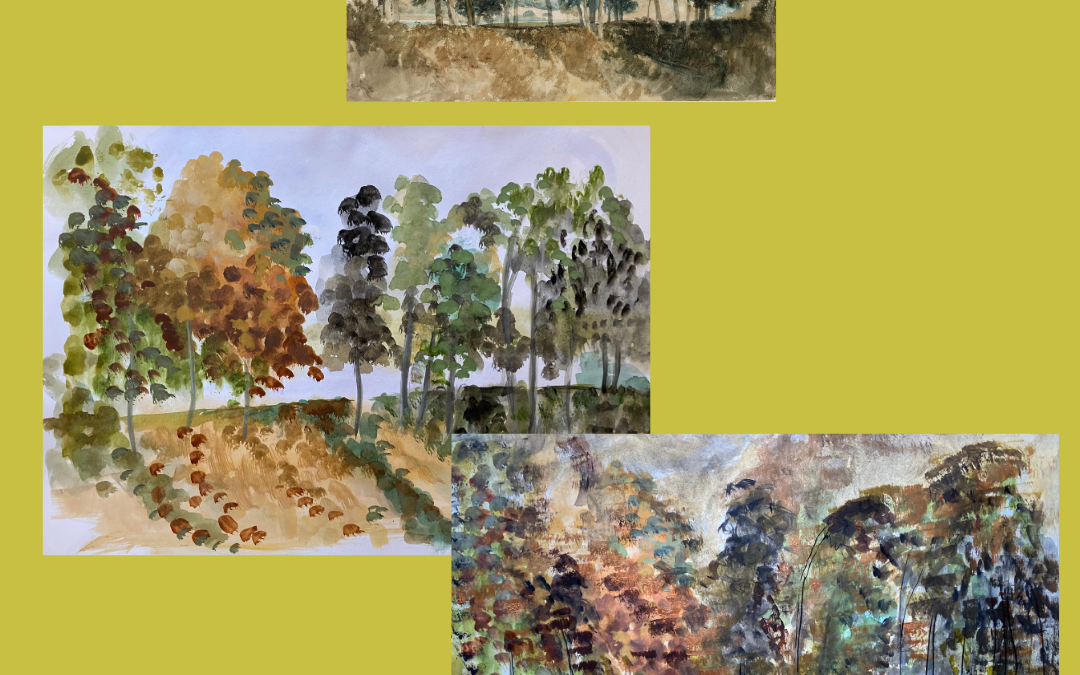
Learning from Turner I really enjoyed the back catalogue session on learning from Turner. I'm sharing a watercolour he made in 1805 which I used as a reference to try and learn from his brushstrokes and mark making. Version 1 is when I was looking at the...

by Mark Dunford | 17th November 2024
Caravaggio – Supper at Emmaus

by Mark Dunford | 17th November 2024
Patrick George – Moreton Terrace

by Mark Dunford | 16th November 2024
Antonio-Lopez-Garcia – detail
by ELIZABETH MURRAY | 14th November 2024
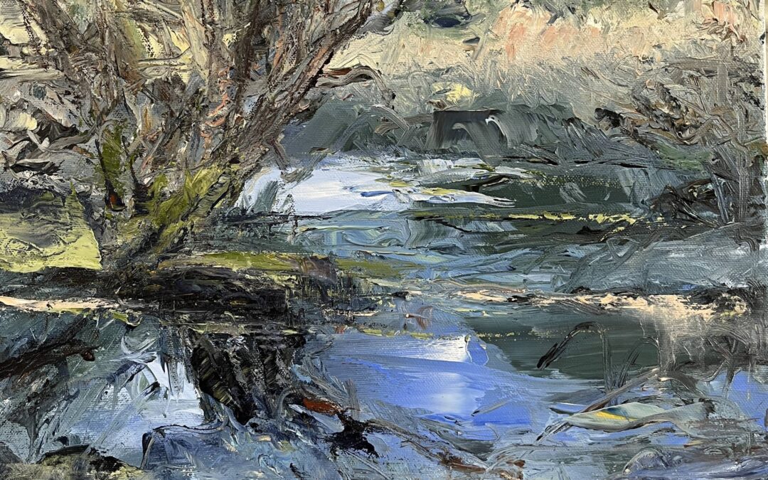
Oil painting from sketch of trees in floodwater. I worked without looking at my sketches
by Rachel O’M | 14th November 2024
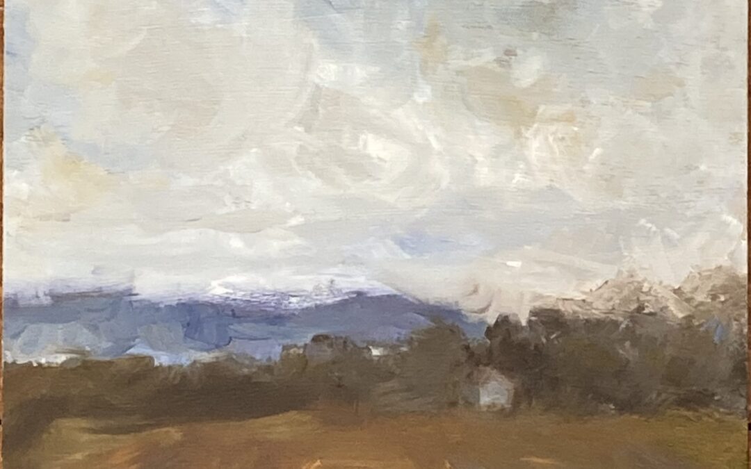
I went through my sketchbooks and made this oil sketch from the memory of a day last March. I also tried to keep some of those compositional elements Louise discussed in the last video in the back of my mind as I was working. I enjoyed the square format-8”...
by Therese Lunde | 13th November 2024
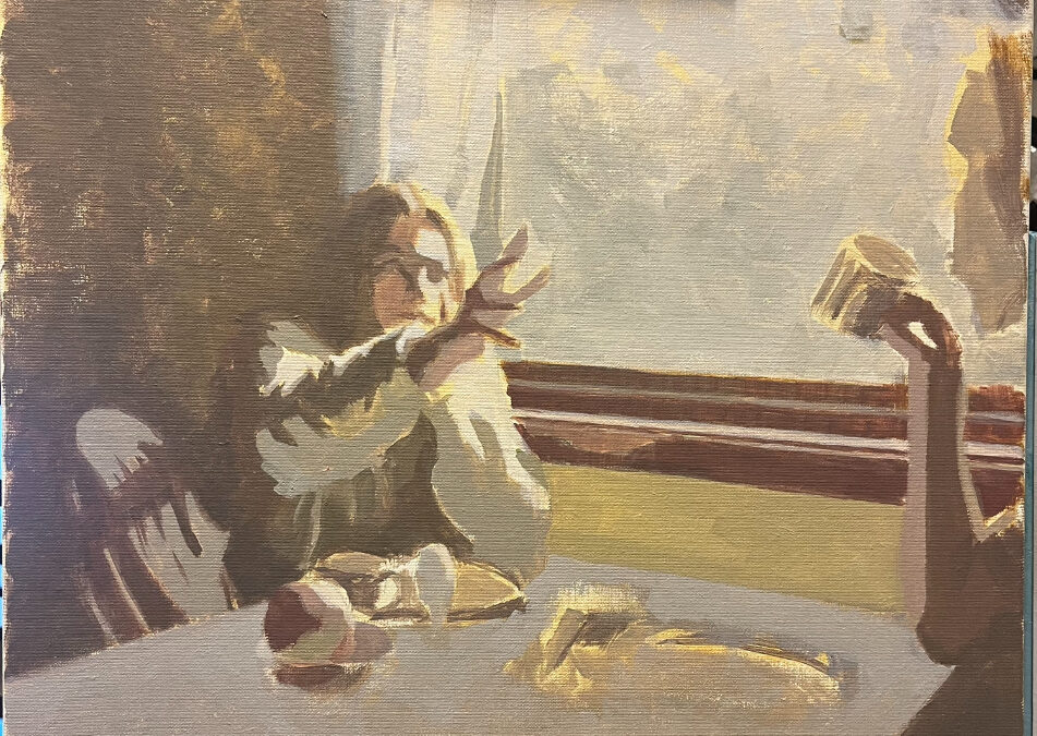
I am working on a value study for the painting of the breakfast scene. Instead of continuing to work on the large painting, I want to start a smaller study/copy and test out changes. I want to focus on compressing the value scale and limit the color palette. I hope...
by Ann May | 12th November 2024
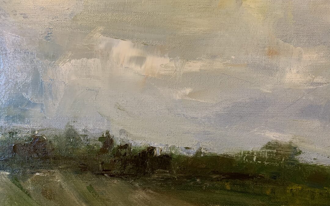
Oil Painting from watercolour sketches… quite challenging not to look at original sketches!

by Sandra Lundin | 9th November 2024
Actual view of the farmers road you can see it beyond he driveway across the street as it moves up through the field. I was actually attracted to the beam of light that cuts across just after sunrise.

by Sandra Lundin | 9th November 2024
Morning study of the farmers road across the street from the upper foyer window.
by Chris Lovie-Tyler | 7th November 2024
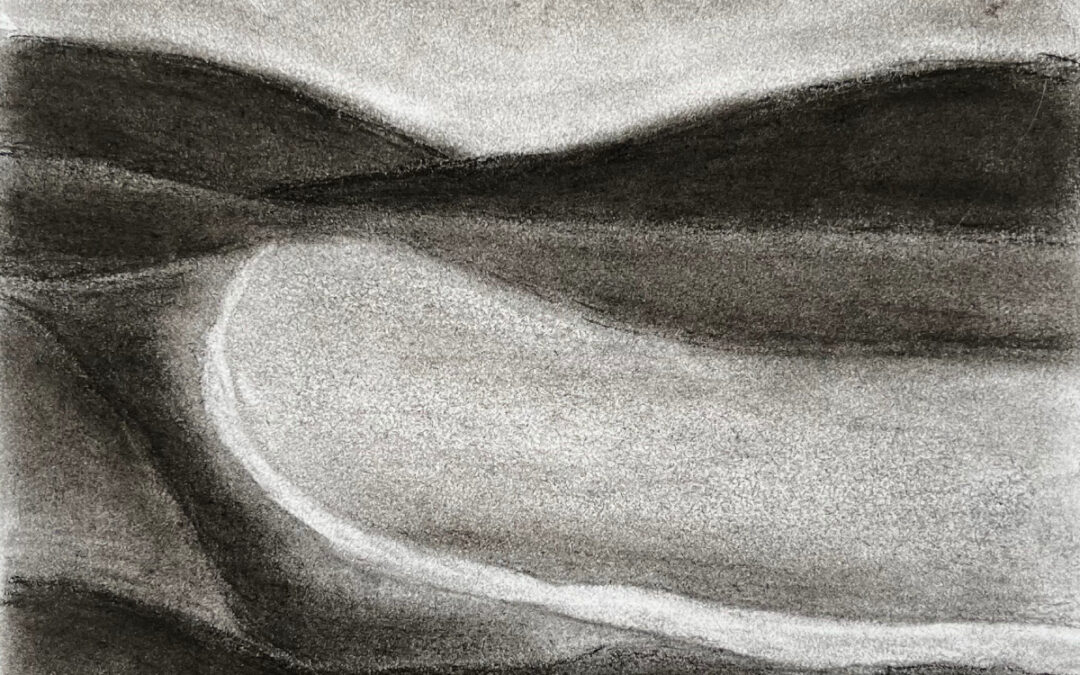
Also off the back of the Turner lesson (October 2023), I did this charcoal transcription of Colin McCahon's 'A Southern Landscape, 1950'. McCahon is my favourite artist, and painted very stylised and increasingly simplified/abstracted landscapes. (He...
